A Site Redesign Using D3 and CSS3
Originally, my homepage was basically just thrown together over a weekend. I knew what kind of design I wanted, but when it actually came to implementing it, I was a little stuck. The idea was to have a subtly animating grid of svg elements that blinked softly with some CSS3 transitions, pretty to look at, not particularly taxing on the CPU, and fun to implement.
However, when getting to add the number of svg elements I wanted to the page using the fantastic D3 library, the page chugged a good deal on load, taking a good 5 seconds or so to catch it’s breath and render out the pretty squares. This wasn’t really acceptable, so while it did look like I’d probably made a mistake somewhere like a D3 performance faux pas, I did want to get the site up and running quickly and as close to the initial vision I had.
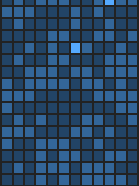
So I did what anyone would do, I used a super huge table and styled the elements.

…Well okay maybe not everyone would do that, and in fact it’s a pretty silly idea. But it worked! and it was lightning fast compared to my previous effort, so I left it alone. That is until now.
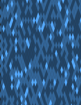
Since I had a little bit of free time over the past week, I’ve put together something closer to the original idea technology wise, but, since this is 2015 and squares are so last year, I decided to go with diamonds instead.
Since I’d been burned before, I started off trying to go back to basic principles, and adding the svg elements through plain old javascript, using the CreateNSElement method and using triangles in the hope it would be half the problem of a diamond. While this worked, it was pretty clunky as you can see:
Then once I’d got tired of doing everything in a particularly long-winded way, I decided to use something marginally more modern, and switched over to simply adding the elements using JQuery’s append method, which looked a bit like this:
This however had it’s own problems, as I found when at first it just didn’t work. I soon found there was a hack to get svgs working with the append method, found here on stack overflow.
and then adapted slightly here:
While the hack worked, it seemed JQuery really wasn’t designed for what I was attempting to do, so I figured the best bet was to revisit D3 again and try to get to the bottom of the performance issues.
Since I’d added the criteria of it now being diamonds instead of squares, that meant rect was out, and polygon was in. Or so I thought.
Path was actually the better choice for this, as I soon found out after trying to hand-craft the point attributes for a couple thousand polygons. D3 uses a sort of mini-language to dictate how a path is formed, which explains the path of the shape as if it was being drawn by a pen on some paper.
For my case this meant that to draw myself a simple yet nice looking diamond, all that was needed was this:
Then, to adapt that to render out a similar number to how many rectangles we currently have on the site we just have to update the attributes in a loop and draw lots of diamonds, with some simple formatting:
This is pretty hacky with lots of magic numbers, but it serves well to show how quickly you can get something working with D3.
Finally, after a good deal of tweaks to the math and general tinkering, the effect was taking shape!

This is still in the proof of concept stages, but it does go to show how easy it is to make something using d3 with a little persistence. The code will be up on github in a branch for the site redesign soon if you’re interested, or if you want to see me experimenting in realtime, the JSBin is right here.